Is the new DAP rocket the wrong colour?
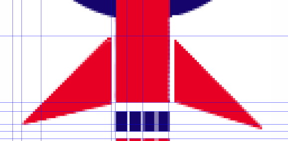
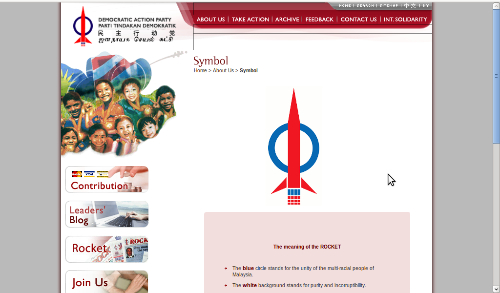
December 5th, 2009 | by Sean |I was thinking of writing an article about the Jalur Gemilang – the Malaysian national flag – and the importance of very carefully specifying your ‘brand’, and remembered I’d written about Malayisia’s Democratic Action Party (DAP) logo before. Last time I wrote about DAP’s logo, I mentioned that the version on their official website seems to have been badly drawn. You can see in the screenshot that I took of the original logo that the Inkscape guidelines show the logo elements don’t line up at all! DAP seem to have updated the logo on their website, so it isn’t wonky any more. Now the colour is wrong! You can see they still have some old branding at top left showing the old ‘wonky’ rocket with a dark blue circle. Now the new symmetrical DAP rocket has a light-blue circle!
I’m hoping I will be able to find a specification for the Jalur Gemilang somewhere, but I hope the DAP – or one of the other Pakatan Rakyat (Opposition Pact) parties – will be first to the Internet with a demonstration of how an open, transparent political organisation would competently specify its most famous brand. How else can we promote these things properly, unless they’re unambiguously defined?
In my previous article, I pointed out some things about DAP’s symbolism that I thought were counter-productive to their cause – as well as objectionable to any reasonable person. While I was tracking down old versions of the wonky DAP rocket (included here just for ‘completeness’), I saw very many Malaysian political blogs. The mainstream media in Malaysia is terrible for political comment. Owned by powerful businesses closely tied to the current government, it’s practically pure propaganda – it’s simply awful to read.
The online scene is much livelier – I particularly liked the summary posted at “Malaysians Unplugged Uncensored“, where I found the old version of the wonky rocket. It’s originally from “Politics 101 Malaysia”, which I used to read a couple of years ago, but seems to have disappeared. See Point 7 of The REAL meaning of DAP’s “The Rocket” on their blog round-up article of 10th February, 2007. It made me smile, anyway.
In my previous article, I produced an SVG (Scalable Vector Graphics) file using Inkscape. SVG artwork can be scaled to any size without the ‘jagged edges’ on curves that result when you scale bitmapped files. DAP could produce official artwork in such a format, with perhaps a few representative bitmapped files exported from it in various sizes. End-users of the DAP brand would then have identical artwork on their own publications.
Another alternative – which would be slightly more work to do properly – would be to produce unambiguous plain-language specifications that would allow a graphic artist or draughtsman to re-create the brand. Then again, if a political party can’t ‘do’ it’s own brand properly, on what basis do we support them in their bid to run the country?
Just for the sake of enormous rockets, here’s my version of the DAP logo once more, as a 932×2000 PNG exported from the SVG file. There is a shortcoming in my version of the file – there’s no background specified, only a white circle overlaid on the blue circle to make the roundel. If you wanted to go one better than me, you could address that issue in your own SVG file, and then write a blog article criticising my attempt. You can download my SVG file by clicking on the rocket:


