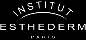
Institut Esthederm logo (Lolyco’s version)
It’s not as though I’ve got all the time in the world, and this does, at first glance appear to be a complete waste of time. But sometimes time is best wasted, like spending too much on shoes or drinks or a shirt you only wear once, throwing away time makes you feel like you’ve got it to burn!
Jess wanted some pictures with the Institut Esthederm logo in them, but the only versions I could find online were very small, so resizing them made them look horrible. She had a version on a disk too, courtesy of a trip to Esthecosme, her supplier. It was the old black-on-white version of the logo, and in an EPS (Encapsulated Post Script) file. Even though it was a huge (over 300kB!) file, it still had jagged edges!
I’d recently done a few articles about Inkscape, the drawing program, for isono.my, so I thought I’d test my new-found skills on the Institut Esthederm logo. I’m not a graphic designer, so I may not have gone about it quite right. It was easy enough, with perhaps the only tricky bit the kerning (spacing between characters) of the text. It’s very easy to change the kerning of text in Inkscape, once you know how – it’s not obvious!
Before you use this logo in any of your own work, please note that it isn’t Institut Esthederm’s logo, it’s Lolyco’s reconstruction of it. It does look like their logo (okay, so the first ‘I’ and the last ‘T’ in the curved INSTITUT at top are not quite rotated as much as the original), but if you really wanted to use Institut Esthederm’s logo in your own documents, we strongly recommend asking Institut Esthederm for a better, official version. I could have done that, but patience is not a virtue I possess.
If you want a resizable (to any size) version that you can use with Inkscape (so you can fix the rotation on the ‘I’ and the ‘T’!), Institut Esthederm logo, SVG format, zipped.


 Entrepreneur -